
The Mobile Mistake: Why Your Mobile Website Needs Bespoke Navigation (and Feels Like an App!)
Let's talk about Bespoke Mobile Navigation and how it's Essential
(and App-Like Functionality Matters)
In today's digital landscape, mobile isn't just an afterthought – it's often the first point of contact.
Users are increasingly browsing, shopping, and engaging with content on their smartphones. So, why are so many websites still clinging to desktop-centric navigation on mobile? It's a recipe for frustration, leading to high bounce rates and lost conversions. The solution? Bespoke mobile navigation, and websites that feel as smooth and intuitive as native apps.
The Problem with Scaled-Down Desktop Menus
Think about it: a complex, multi-tiered dropdown menu designed for a wide desktop screen crammed onto a narrow mobile display. It's a usability nightmare. Tiny text, fiddly dropdowns, and an overwhelming amount of information make navigating a chore. Users are left pinching, zooming, and struggling to find what they need.
This leads to:
- Increased Bounce Rates: Frustrated users quickly leave for a competitor with a smoother mobile experience.
- Lower Conversion Rates: Difficult navigation hinders the user journey, impacting sales and leads.
- Poor User Experience: A clunky mobile site damages your brand's reputation.
Got a question and want to talk to us? you can call us 01384 931011,
or
send us your details here
Why Bespoke Mobile Navigation is Essential (and App-Like Functionality Matters)
A bespoke mobile navigation is designed specifically for the mobile context. It prioritizes simplicity, clarity, and ease of use. But in today's world, that's not enough. Users expect mobile websites to perform and feel like native applications.
Here's why it's crucial:
- Optimised for Touch: Large, easily tappable buttons and intuitive gestures make navigation effortless.
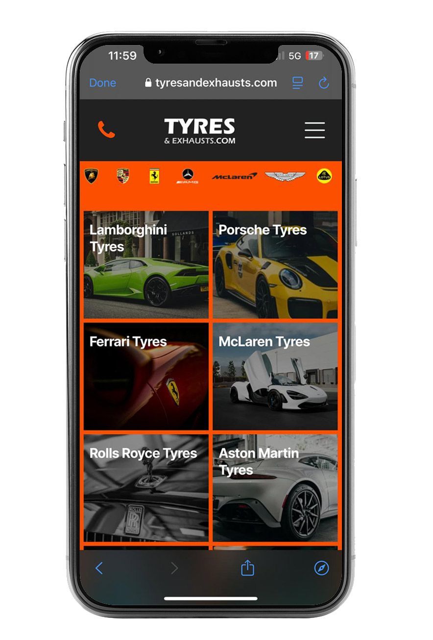
- Prioritised Content: Essential links and features are front and centre, minimising clutter.
- Simplified Structure: A streamlined menu structure ensures users can quickly find what they're looking for.
- Enhanced User Experience: A smooth and intuitive mobile experience fosters positive engagement and builds brand loyalty.
- Improved Accessibility: Well-designed mobile navigation helps all users, including those with accessibility needs, to easily navigate your website.
- App-Like Speed and Performance: Users expect instant loading times and fluid interactions.
- Offline Capabilities: Progressive Web Apps (PWAs) can offer limited offline functionality, enhancing user experience.
- Seamless Transitions and Animations: Smooth transitions and animations create a more engaging and immersive experience.
S i Design: Building with a Mobile-First, App-Like Mindset
At S i Design, we understand the importance of a seamless mobile experience that feels like an app. We build websites with a mobile-first mindset, built as Progressive Web Apps (PWAs) for offline availability, all whilst ensuring that every design decision is made with the mobile user in mind, and that the website performs at the highest speeds possible.
How We Approach Mobile Navigation (and App-Like Functionality):
- Strategic Planning: We begin by understanding your target audience and their mobile browsing habits. We analyse your website's content and prioritize essential links.
- Intuitive Design: We employ clean, minimalist designs that are optimized for touchscreens. We use clear, concise labels and large, easily tappable buttons.
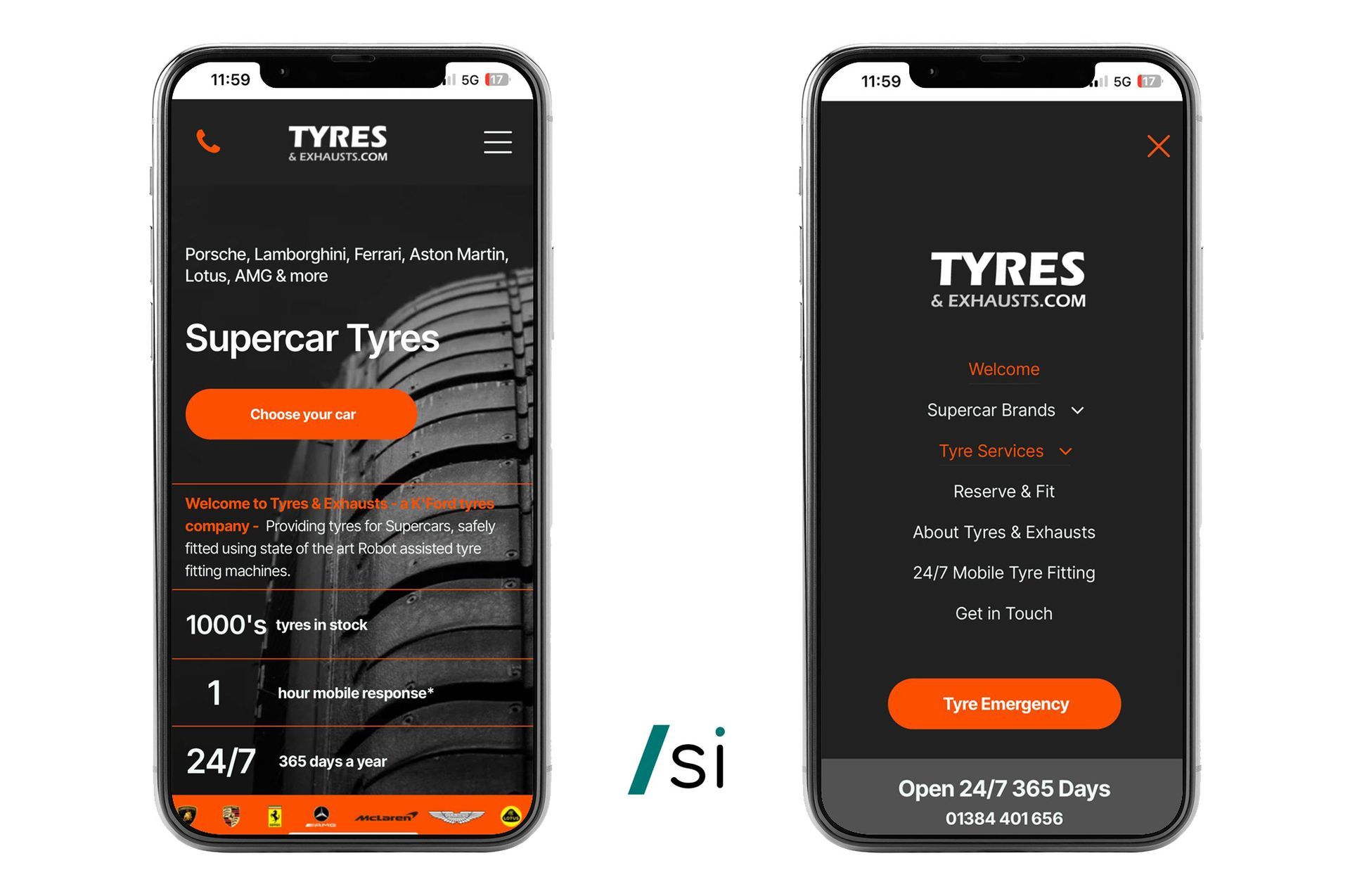
- Common Mobile Patterns: We leverage familiar mobile navigation patterns, such as hamburger menus, bottom navigation bars, and off-canvas menus, ensuring users can navigate instinctively.
- Performance Optimisation: We prioritize fast loading times and smooth animations to enhance the mobile experience and create app like speed.
- Progressive Web App (PWA) Implementation: We can build PWAs that offer app-like features, such as offline capabilities, push notifications, and home screen installation.
- Seamless Transitions and Animations: We use subtle animations and transitions to create a more engaging and fluid user experience.
- Thorough Testing: We rigorously test our mobile navigation and app-like features across various devices and screen sizes to ensure optimal performance.
- Progressive Enhancement: We ensure that the core functionality of a website is accessible to all users and then add enhanced features for devices that can support them. See examples of our mobile first web sites
Examples of Mobile Navigation and App-Like Strategies:
- Hamburger Menu: A classic mobile navigation pattern that hides the main menu behind a three-line icon, maximizing screen real estate.
- Tailored Navigation: Ideal for apps and mobile-first websites, providing quick access to essential features and calls to action (CTA’s).
- Off-Canvas Menu: A sliding menu that appears from the side of the screen, offering a clean and organized navigation experience.
- Search Functionality: Prominent search bars enable users to quickly find specific content.
- Service Workers (PWAs): Allow for offline caching and background synchronisation,
- Web App Manifest (PWAs): Enables users to add the website to their home screen as an app icon.
Invest in Your Mobile Experience (and Make it App-Like)
Don't let your mobile website be an afterthought. Invest in bespoke navigation and app-like functionality that prioritises user experience and drives results. At S i Design, we're passionate about creating mobile-first websites that deliver exceptional experiences. Contact us today to learn how we can help you optimise your mobile navigation and create a website that feels like a native app.
#1
Web Design and Digital Marketing
100's
Happy clients to date
FREE
Consultation
Get found with Presence
What's the point of having a website if no one can find it. Organic SEO and Digital Placement for getting found.
Designed for your users
We design for your users to convince them that you can help. After the SEO phase found them, it's time to convert them.
On every device
From smart phones, watches, ipads and 100" TV screens, designed to work on all devices and any screen.
Build Campaigns at your fingertips
Build loyalty and track what works -Interact, capture in a CRM and market to your audience with email marketing newsletters, offers, stories and more.
Consultancy Services to support you
As digital solutions specialists we support you with sales and marketing, to helping find solution suppliers, to coaching design teams and sales teams.
Don't get left behind - have Presence
Talk to us about making your brand unique, have a voice and get seen and found online.
See our latest projects and work